
自强明德,合众至善
United, We Can Be the Best!
This is Unibest's single source of visual identity: why our color is called Taiyi Violet, how the five-step palette is used, what our gesture means, how the mark must be used (aligned with the official VIS Manual 2025), and where staff download the official source files. Color is finalized as Option A — the Taiyi Violet gradient axis #514FB9 → #BB29BC rules every digital surface; one-color print ink #784F9D follows manual A3-05. Everything below is binding for company documents and materials.
01 · Mission / Vision / Values
Mission · Vision · Core Values
The motto is the core value: eight characters in two movements, from the inside out — first cultivate oneself, then uplift others.
Mission
Uniting strengths toward the utmost good — sustainable solutions for the pharmaceutical industry, safeguarding human health.
Vision
To build Unibest into a first-class, respected international pharmaceutical enterprise.
自强明德,合众至善
United, We Can Be the Best!
自强
Zì Qiáng
The Book of Changes, Qian hexagram, Commentary on the Image: “As heaven moves with vigor, the noble ceaselessly strives to strengthen themselves.”
Vigor in action — get it done, without waiting to be carried.
明德
Míng Dé
The Book of Changes, Kun hexagram, Commentary on the Image: “As the earth’s terrain is receptive, the noble carries all things with profound virtue.”
Character within — capability matters, but integrity and credit come first.
合众
Hé Zhòng
The Great Learning: “…in renewing the people” (qinmin).
Win hearts with virtue, rally people around a shared mission — to grow together and strive for our common cause.
至善
Zhì Shàn
The Great Learning: “Rest in the highest good.”
The final destination — delivery is not the end; exceeding expectations is.
The Great Learning runs as one chain: illuminate bright virtue (Mingde) → renew the people (Hezhong — union) → rest in the highest good (Zhishan). Virtue illuminated turns outward into union; union completes itself in the highest good. The Book of Changes supplies the engine — ceaseless self-strengthening. Inside: strengthen and cultivate. Outside: unite and perfect. United, We Can Be the Best!
02 · Taiyi Violet
Taiyi Violet — The Color of Origin
Not a made-up name — one of the oldest words of origin in Chinese thought, and the color where the One dwells.
What is Taiyi
Taiyi is not an invented brand word — it is one of the oldest terms of origin in Chinese thought. Zhuangzi says Laozi’s teaching “centers on Taiyi”; Lüshi Chunqiu says “the ten thousand things are born from Taiyi”; the Book of Rites reads Taiyi as the undifferentiated vital breath before heaven and earth separated. Three senses converge: origin (the single starting point of every decision), the absolute One, and the dwelling — the Purple Palace, where Taiyi resides.
Purple is the highest-energy color
Within visible light, violet has the shortest wavelength and the highest frequency — the highest-energy color there is. That is exactly what our “utmost good” means: the highest energy paired with the highest standard — every delivery pushed to the peak. (The Huainanzi agrees: “The Purple Palace is the dwelling of Taiyi” — purple has always been the color of the supreme.) Meaning and color meet at “the highest”. Taiyi Violet = origin (Taiyi) + the utmost good (purple) — the Color of Origin.
Purple qi arrives from the east
In Chinese idiom, “purple qi from the east” is the auspicious sign of a beginning. Every project kickoff, every partnership starting point is such a moment — all the R&D, market access and commercialization that follow stand on that first decision. Taiyi Violet reminds us: this decision deserves to be taken seriously; and every step after it should trace back to that single, clean source.
Why not ‘Deep Space Purple’
‘Deep Space Purple’ was a candidate. Beautiful — but it speaks of distance: remote, cold, something to look up at. We would rather speak of where things come from. An intermediary’s value is not spectacle; it is finding the source and the order inside complexity — that is what ‘Color of Origin’ means in business.
03 · Color System
Color System — Five Steps
Taiyi Violet is not a single hex — it is a five-step scale, each step with one name and one job. In a data-dense interface purple appears far more often than on a normal website; one color carrying navigation, buttons, charts and backgrounds at once blurs everything into a purple haze. Five steps keep the hierarchy legible. All five live inside one purple family: from magenta-red (Taiyi Magenta) into deep violet (Deep Violet), then fading out through Cloud and Faint — one continuous order, not five scattered swatches.
One gradient axis only: Taiyi Violet #514FB9 → Taiyi Magenta #BB29BC. Every gradient draws from this axis — there is no second one. (Option A, finalized 2026-10-15.) Standard color ruling (Taiyi, 2026-10-17): the official manual's A4 standard #484A95→#903E8B is NOT adopted — the brand standard color is this axis, Taiyi Violet; the one-color print ink #784F9D remains print-only per manual A3-05.
太一品红
Taiyi Magenta
#BB29BC
Gradient end (magenta-red)
Forms the single gradient axis with Taiyi Violet: primary buttons, the 3px top hairline, gradient card borders.
太一紫
Taiyi Violet
#514FB9
Primary
Logo, headings, brand signature, primary buttons — where the primary must appear.
深紫
Deep Violet
#2D2B66
Deep end
Dark-mode ground, dark UI structure, print dark backgrounds — the dark end of Taiyi Violet; never a large hero fill.
云层
Cloud
#C9C2F0
Light end
Chart accents, secondary UI elements, dividers and barcode zones on light grounds.
初现
Faint
#F2F0FB
Faint
Light card fills, search-bar ground, the supporting tint under generous whitespace.
The true ground of the system is white. Purple answers “whose is this”; white answers “can I read it.” Restraint in brand exposure is itself a measure of professionalism.
Digital surfaces (website, systems, PPT, email) always use the five steps and the single gradient axis above. One-color print ink (single-color printing, stamps, fax) follows manual A3-05 with #784F9D — that is a print-ink violet, not the digital primary. Do not mix the two.
Where Deep Violet comes from: Taiyi Violet turned one notch darker — not a newly picked color. The hue (which color it is, 241°) and the saturation (how vivid) stay put; only the lightness (brightness) drops from 52% to 28% — to reproduce it, just take Taiyi Violet and set its lightness to 28%. This does not conflict with the single gradient axis: the axis governs how two colors blend in a gradient, while solid blocks like Deep Violet belong to the tonal family (plain shade steps of one color). Depth is made by lowering brightness — never by adding black or gray — which is also how Google, Heroku and other global brands build their palettes.
Regional color note (for international markets): purple reads as royalty and innovation across Europe and the Americas (the Twitch / FedEx strategy), but it is linked with mourning in India, Thailand and Brazil — widows in Thailand wear purple, purple is considered unlucky in Brazil — and India is a core market for us. Three practices: (1) for materials aimed at these markets, favor white grounds with purple as outlines and accents instead of large purple fields; (2) avoid large purple areas on formal announcements and white-paper covers — use purple on white instead; (3) impact in B2B (business-to-business) settings is actually small — clients judge professionalism and quality — so this is a safe-handling rule, not a ban.
04 · The Gesture
The Gesture — U + B = UniBest
A fist with thumb, index and little finger extended — the universal “I love you” sign. We give it an internal reading of our own: index and little finger form a U; thumb and index form a B. Together — UniBest.
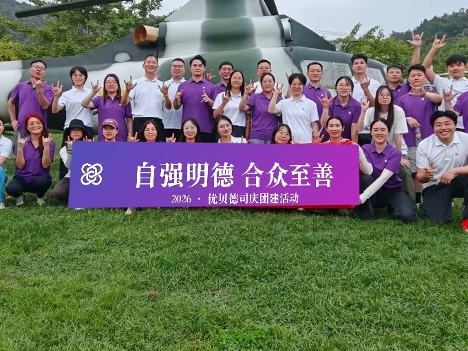
Index + Little = U
Two fingers standing side by side — the U of United. Union is the first of our values.
Thumb + Index = B
Thumb and index open like a ring — the B of Best. The highest good is where our values arrive.
Three fingers = I love you
Thumb, index and little finger together — the international sign of goodwill. In health business, goodwill is the ground.
The gesture belongs to team culture, group photos and friendly occasions; the Unibest ring mark remains the primary brand identity. The U + B reading is our own internal convention.
05 · The Mark
Mark Usage — Official Manual
Digested from the official Unibest VIS Manual (2025 edition): A1 Symbol, A2 Typeface, A3 Combination, A4 Color, A5 Restrictions. The mark is a designed whole — never alter its shape, structure or proportions (sole exception: the official Chinese-knot four-ring mark for favicons / browser tabs, see rules below). The mark gradient is finalized as Taiyi Violet (Option A, 2026-10-15), aligned with the site's single gradient axis.

Möbius Ring
The skeleton of the mark — infinity and circulation, connection and flow.
DNA Double Helix
The genetic code of life sciences — the health industry we serve.
Benzene Ring
The molecular language of pharmaceutical chemistry — a hexagon at the heart of the knot.
Capsule
The shape of a capsule — our full chain from APIs to formulations.
Heart
The warmth of care. “Pharmaceutical science with care for life” is the brand's core idea.
Lockups

Horizontal Lockup (primary)
Mark (4.67a wide × 4.5a high) + 1.75a gap + wordmark, 22.6a overall. The default for most occasions.
Vertical Lockup
Mark above, wordmark below — for square or vertical spaces (booth backdrops, brochure covers).
Mark Only
Graphic only — avatars, watermarks, favicons, any size where the wordmark can't stay legible.
Clear Space
Keep clear space of at least a on all sides (a = grid unit, about 1/4.5 of the mark height). No text, graphics or borders inside.
Minimum Size
Horizontal lockup ≥ 7mm print / 20px screen; English lockup ≥ 3.5mm / 10px; vertical ≥ 15mm / 42.5px. Below that, use the mark alone.
Mono & Reversed
White reversed version on dark grounds; single-color violet #784F9D for one-color printing (print ink only — not the digital primary); see manual A3-05 for fax/stamp use.
Chinese-Knot Mark for Micro Sizes (v1.2 exception)
Favicons, browser tabs and micro icons ≤24px always use the official Chinese-knot four-ring mark: the white interlaced ring mark on a Taiyi Violet gradient rounded square (#514FB9→#BB29BC). This is the sole exception to the shape rule — outside the official micro-size asset, the standard mark must never be altered in shape, structure or proportion. (Fixed by Taiyi, 2026-10-20: browser icons use the four-ring Chinese knot; the 2026-10-17 simplified twin-ring is retired.)
Chinese — Source Han Sans
English — Source Han Serif
Restrictions (Manual A5)
Don't stretch or squash the mark
Don't rotate or flip the mark
Don't change element angles
Don't add drop shadows
Don't change the standard colors
Don't outline or stroke the mark
Don't change the wordmark typeface
Don't change element proportions
Don't rearrange mark and wordmark
Don't use blurry or low-quality files
06 · Typography
Typography
Type is the brand's voice. The Chinese sans family carries body copy; the serif family is reserved for brand phrases and the motto (cultural texture). Latin and numerals follow the body stack. Weight usage is in the mark-usage section above (Manual A2).
Body · Chinese sans
Live web stack: PingFang SC / Microsoft YaHei / Segoe UI / Helvetica / Arial. All body copy, headings, tables and forms — clear and stable.
Brand phrases · Chinese serif
The motto “自强明德,合众至善” and material headlines use a serif family (e.g. Songti) — brand materials only, never body copy on the web.
Latin & numerals
Same stack as body copy (Segoe UI / Helvetica / Arial). Tabular figures right-aligned; technical numbers (amounts, CAS) in plain regular weight, no decoration.
| Level | Size / Weight | Use |
|---|---|---|
| H1 | 24–28 px · Semibold | Page title |
| H2 | 18–20 px · Semibold | Section head |
| H3 | 15–16 px · Semibold | Card title |
| Body | 14–15 px · Regular · 行高 1.6–1.75 | Body copy |
| Caption | 12 px · Regular | Captions, helpers |
| Micro | 11 px · Regular | Legal, ICP, footnotes |
07 · UI Colors
UI Colors — Neutrals & Semantics
Brand violet carries identity; neutrals carry readability. Body text and backgrounds always use the neutrals — violet is for emphasis (buttons, links, accent bars). Semantics follow system convention: success green, warning amber, error red, info violet.
ink-50
#F6F7F9
Page tint
ink-100
#ECEEF2
Dividers, disabled
ink-300
#B0B9C9
Borders, strokes
ink-500
#66708A
Placeholders
ink-700
#424A5E
Secondary text
ink-900
#1F2430
Body & headings
Success #059669
Live, passed, ✅ states
Warning #D97706
Pending, watch, ⚠️ states
Error #DC2626
Failed, risk, ❌ states
Info #514FB9
Hints, emphasis, links — that is brand violet
| Pair | Ratio | Note |
|---|---|---|
| 品牌紫字 / 白底 | 6.63 : 1 | Passes AA and AAA large text (buttons, links, headings) |
| 白字 / 品牌紫底 | 6.63 : 1 | Primary buttons, violet banners |
| 白字 / 品红底 | 5.05 : 1 | Passes AA; gradient endpoint — accents, not small text |
| 正文 ink-900 / 白底 | 15.52 : 1 | Ample for body copy |
| 次要字 ink-600 / 白底 | 6.87 : 1 | Secondary text also passes AA |
| 品牌字 / 浅紫底 | 5.88 : 1 | Emphasis on light-violet cards |
| 白字 / 深紫底 | 12.74 : 1 | Deep-violet panels, dark footer |
08 · Photography
Photography — Keep It Real
Our photos are evidence, not scenery. Real people, real places, real colours — a principle also earned through a revert on 2026-10-17.
Real over staged
Use real company events, plants, exhibitions and team gatherings — not stock staging. A plain honest photo beats a fake scene.
True colour
Basic exposure and crop only — no recolouring, no hue swaps, no heavy grading. Clothes and surroundings stay as they were.
Brand in scene
If brand colour should appear in a photo, put it into physical materials (banners, backdrops, uniforms, table signs) — never paint it in afterwards.
Respect people
Consent for recognisable faces; no exaggerated posing or distorting retouch; never crop people in half in group shots.
09 · Applications
Applications
Six everyday formats. Before producing anything, check the four elements: mark, standard colours, slogan, breathing space.
Business card
The in-use card is the standard — reproduce it exactly (see the real card below). White ground, two bilingual faces: English face carries the corporate slogan top-left, Chinese face the motto; UNIBEST lockup top-right; name, title and company at left; four icon-led contact rows (tel / mobile / email / address); unibestpharm.com bottom-right; faint violet world-map backdrop.

自强明德,合众至善
Banner / backdrop
135° Taiyi-violet gradient ground (#514FB9 → deep violet or magenta), white serif type, white reversed mark, centred or left-aligned (the 23rd-anniversary banner style, finalized 2026-10-17).
Bridging Innovation for Health
汇报模板 · 封面
PPT / decks
Cover: violet gradient + white mark + corporate slogan. Inner pages: white ground, ink type, brand-violet title bars; charts in the violet scale with magenta accents.

Allan Ko
Chairman
Staff badge
White ground + vertical lockup + name (ink-900) + title (ink-700, e.g. Chairman); keep it restrained — no slogans on badges.
Allan Ko · Chairman
宁波优贝德进出口有限公司
T +86-574-2785-5666 · allanko@unibestcn.com

Email signature
Four plain lines (name · title / company / phone / email — same details as the card) + small horizontal lockup (≥ 20px tall); no slogans or QR clutter.
Web / digital
Violet is emphasis only (buttons, links, title bars, accents); body copy is always ink-900. Gradients are for large grounds, never under body text.
10 · Slogan System
Slogan System — Three Layers
Three lines, three jobs — never stacked together. Rule of thumb: corporate slogan for first impressions, motto for culture, core idea for what we stand for.
Corporate slogan (outward)
Bridging Innovation for Health
桥接医药创新,赋能健康未来
Answers “what we do”. The first line on the site, cards, share cards and deck covers. Chinese rendering follows the employee handbook (bilingual, 2026-10-18).
Motto (cultural core)
United, We Can Be the Best!
自强明德,合众至善
From the Great Learning and the Book of Changes. The bilingual pair is shown together in the manual; on materials the English travels as translation only — never beside the corporate slogan in one frame (decision of 2026-10-17).
Core idea (what we stand for)
Pharmaceutical Science with Care for Life
医药科技与生命关怀
Answers “why we do it”. For brand story, culture, recruiting and social-responsibility contexts. English rendering follows Manual A1.
11 · Downloads
Source Files
Official source files (final artwork, Oct 2026): for Word headers, PPT covers, quotation letterheads and email signatures — always take files from here. No screenshots, no copies of copies, no hand-drawn replicas.
unibest-vis-manual-2025.pdf
Official VIS Manual (2025, 30 pages) — the authority for symbol, typeface, color, combination and restrictions.
unibest-logo-heng-official.png
Horizontal lockup, Taiyi Violet final (3000×1000, transparent) — first choice for Word/PPT/quotation headers.
unibest-mark-mono.png
Official mark, single-color violet #784F9D — one-color printing, stamping, fax.

unibest-mark-simplified.svg
Simplified twin-ring mark, solid Taiyi Violet — retired from browser icons on 2026-10-20 (now the four-ring Chinese knot, see icon.svg / favicon.ico); kept as a spare asset. Never shrink the full mark into this size.

unibest-logo-official.zip
Official logo pack — horizontal/vertical × CN-EN/EN, 7 high-res JPGs.
unibest-logo-cmyk-full.ai
Official CMYK artwork (full lockup, Illustrator) — hand to printers/designers as-is.
unibest-vis-tokens.css
Five-step palette as CSS variables — single source of color for dev and design.